
Most startup websites are easily forgettable - same tired layouts, cheesy stock photos of grinning teams, and buzzwords like digital transformation or innovative solutions that don’t say much. But a few get it right and use design. They use design to ditch the clichés, often through brutal simplicity, unexpected humor, or visuals that make you stop scrolling. No fluff, no tricks - just sharp, thoughtful design that actually works. This article explores ten exemplary startup websites that demonstrate how powerful modern website design can be.
Ask yourself honestly - how long does it take you to decide whether to stay on a website or click away? A few seconds, right? You’re not alone. According to research from Google, it takes just 50 milliseconds for users to form a first impression of a website. And within the next 5–10 seconds, they’ll decide whether to stay or leave.
That’s why startup websites must be user-friendly. Here are UI/UX best practices to make those first seconds work for you:
Clear value proposition. Visitors should know right away what exactly your startup offers.
Fast load time. Even a 1-second delay can hurt website conversion optimization.
Responsive startup website design. Mobile-first layouts are a must, as over 50% of traffic is mobile.
Simple navigation. Guide users smoothly with intuitive menus and CTAs.
Visual appeal. It means clean layout, consistent startup branding strategy, and scroll-worthy visuals.
Trust signals. Logos, testimonials, and security badges build instant credibility.
Don’t forget about the importance of branding for startups – your startup website ideas should be unique and reflect your brand in the tiniest elements. And the main secret is to prioritize usability and continuously test it with real users.
Now that you know the theory, let’s discover how the best startup websites look in reality. Here are ten startup company websites that make the best of UI/UX design services for startups.
Linear
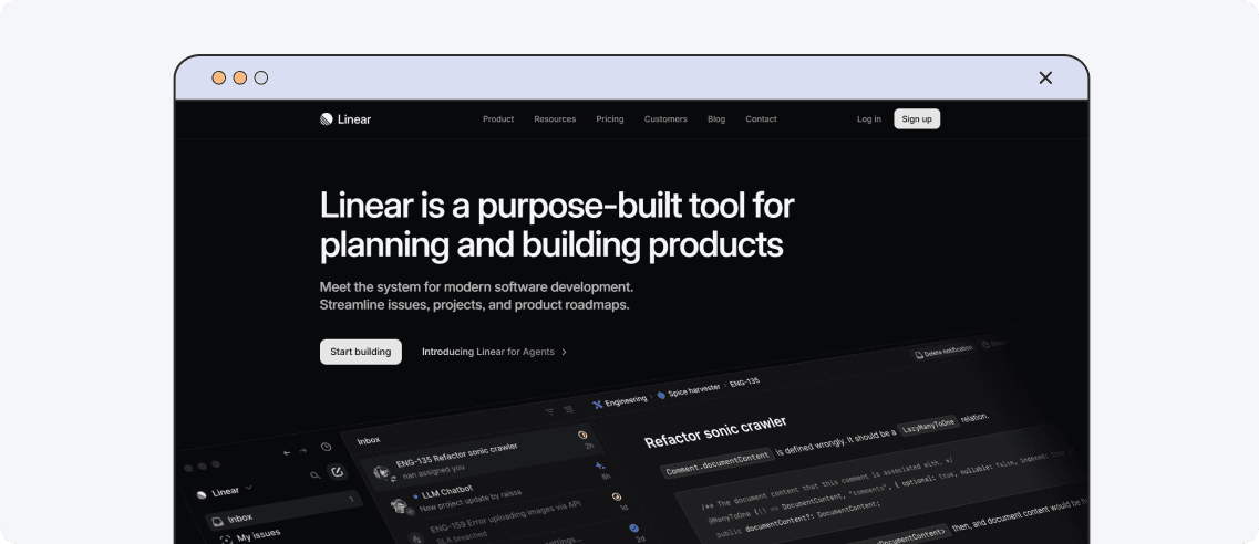
Design hook: Aggressive minimalism that forces focus.
Linear offers project management tools for software teams. Its website embodies minimalism and cuts away all non-essentials. A visitor gets fully focused on clarity and speed. Its monochrome palette and crisp typography mirror the company’s product, and micro-interactions simplify navigation for everyone. The absence of icons in favor of text creates a smooth browsing experience and underlines the value of functionality over decoration. This design proves that the startup takes productivity seriously.
Cometeer
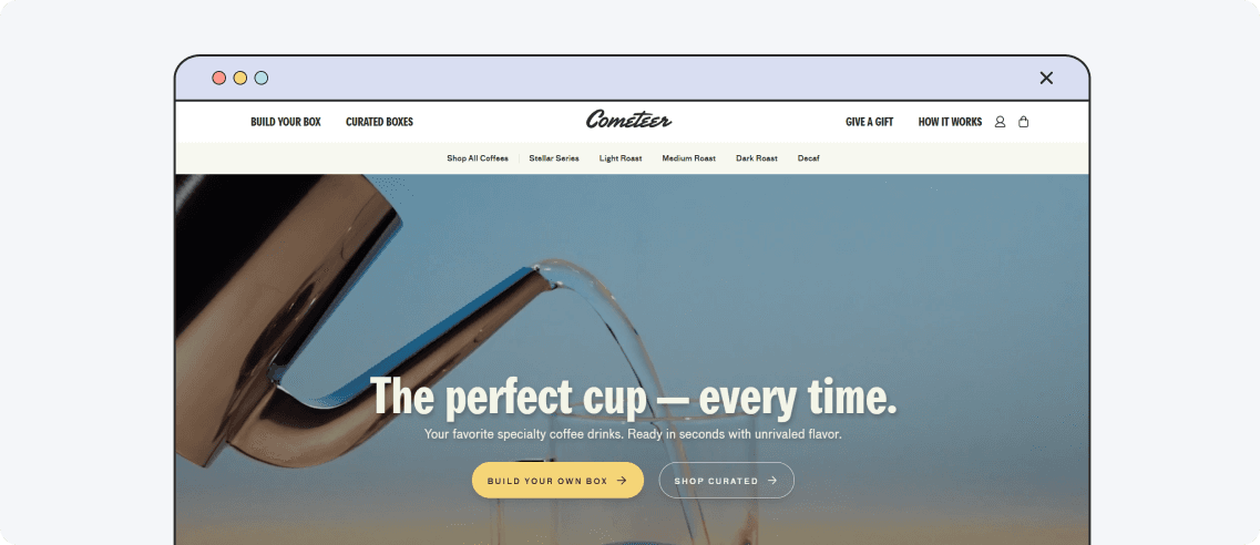
Design hook: Inspiring visual everyday ritual.
Cometeer is a US-based coffee technology company that offers flash-frozen, pre-brewed coffee capsules. Their website successfully captures the ritual of coffee making. High-quality visuals and subtle animations guide users through the brewing process, emphasizing simplicity and convenience. The site’s typography is crisp and legible, and interactive elements create an engaging user experience. The design communicates its brand ethos – high-quality coffee with minimal effort.
Carrd
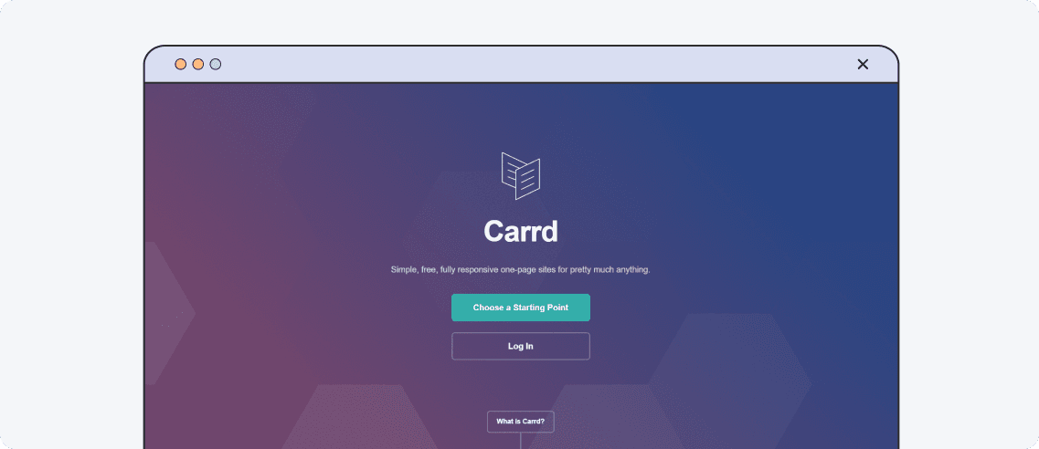
Design hook: The product is the website.
Carrd is a simple, powerful platform for building one-page websites. Its website serves as a live demo of its capabilities. Built using its own platform, it showcases features like animations, forms, and responsive grids in action. Its clean UI design emphasizes functionality, and a CTA is a working contact form. It’s a brilliant example of “show, don’t tell.” This self-referential approach effectively demonstrates Carrd's potential in a single product landing page.
HEY
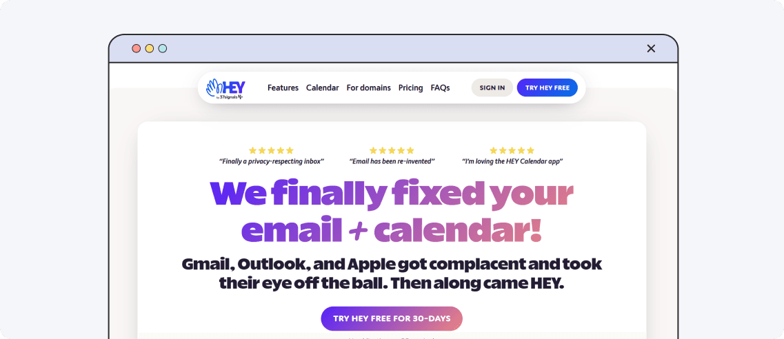
Design hook: Brutalist defiance - email shouldn’t need glitter.
HEY is a premium email and calendar service. But its site rejects SaaS norms - no smiling faces, no loud buzzwords. Just oversized typography, stark contrasts, and un-retouched product screenshots. The anti-design screams about a different kind of email experience that aims to reduce clutter and enhance privacy. It’s appealing to users seeking a straightforward, hype-free email service.
Scribe
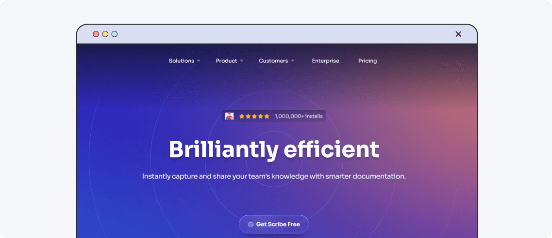
Design hook: Documentation creation should not be boring.
Scribe turns the documentation into an engaging experience. The website features a dynamic “how it works” flowchart that animates as you scroll. Complex processes become visually appealing narratives. Embedded videos provide quick onboarding, and call-to-action buttons guide users effortlessly. This design approach not only captures attention but also demonstrates the strong sides of their product.
Spline
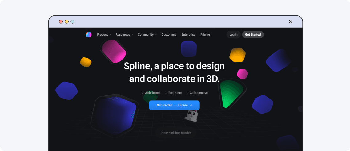
Design hook: Real-time 3D interactivity.
Spline is a 3D design platform that empowers users to create, animate, and collaborate. The homepage immediately immerses you in live, interactive 3D visuals that react as you move your cursor. It effectively shows what the tool can do without explanation. Smooth transitions and soft gradients make the experience feel light, despite the technical complexity. And the CTA speaks for itself: “Get started – it’s free.”
&Walsh
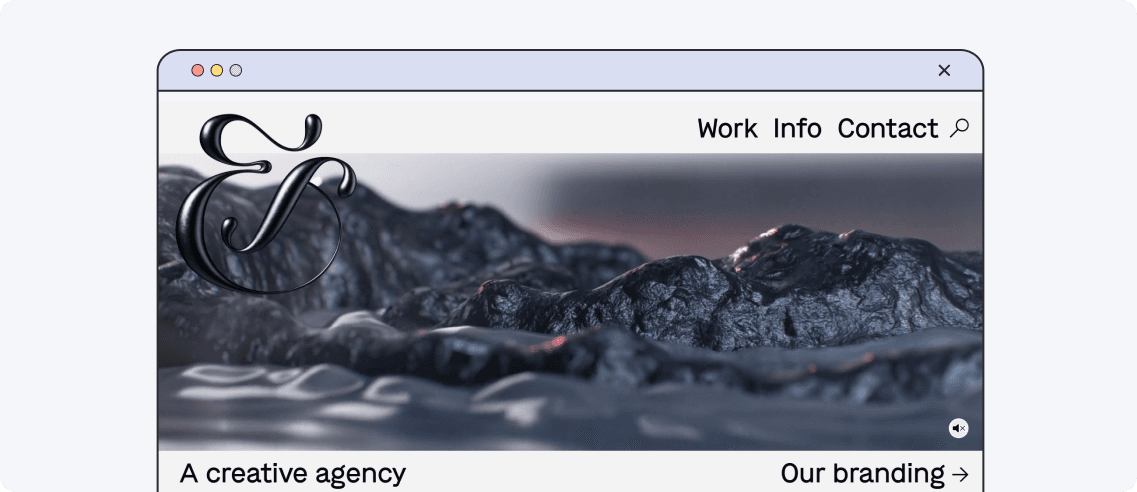
Design hook: Minimal interface, maximal impact.
&Walsh is a branding agency. Its website is a standout example of bold, editorial design that perfectly reflects the agency’s creative spirit. The clean white background puts their colorful, full-screen project images front and center. They have simply turned their website into a canvas that demonstrates their bold projects. Just click on the image to see before/after rebrands. It’s cool how they turned their website into their best portfolio.
Pilot
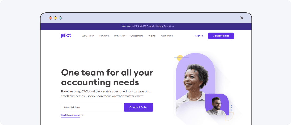
Design hook: Professional simplicity that builds trust.
Pilot is a financial services startup with a clear and simple website. It features a polished, professional design with a reassuring color palette and concise messaging. Everything is front and center without clutter or confusion, from bookkeeping and tax prep to CFO services. Clear call-to-action buttons guide visitors to take the next step, and real client logos and testimonials add credibility. Pilot keeps things simple - and that’s exactly the point.
Drip
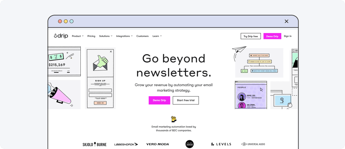
Design hook: Bright, bold, and built for e-commerce brains.
Drip offers automation, segmentation, and personalization for e-commerce brands. Its website grabs your attention right away with bright colors and bold, easy-to-read messages. It directly appeals to online shop owners and shows off features in a fun, clear way. As you scroll, you see how the product works and how it can help grow a business. Overall, it’s a lively and well-organized site that makes a strong first impression.
Tavus
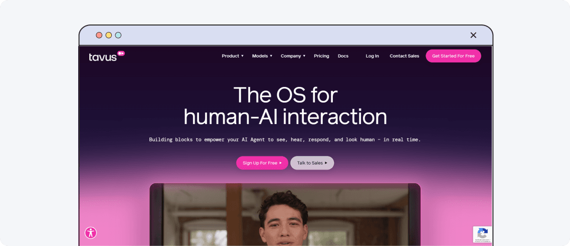
Design hook: Immersive, real-time AI interactions that feel human.
Tavus is an AI video platform that enables businesses to create personalized, human-like video content. Right away, you see what the product does – create realistic video chats with AI agents that look, sound, and respond like real people. Smooth animations and interactive demos help explain how voice cloning and emotional recognition work. The website is both high-tech and simple – ideal tech startup design inspiration.
Modern websites for startups must make an immediate impact. Here are the web design trends 2025 that work for others and will work for your website too:
Clarity. Don’t make your website too complicated. Use plain language that tells visitors exactly what your product does and why they should care.
Show, don’t tell. Forget long explanations, as no one reads them. Strong sites use live demos, animations, and scroll-based visuals to let users test the product.
Keep it clean. Whitespace isn’t wasted space. It guides the eye, removes clutter, and keeps users from bouncing.
Build a journey. Your pages should unfold like a story and immerse users deeper into the experience.
Catch by visuals. Bright colors, bold fonts, and custom graphics make your brand look unique and memorable.
Remember to convert. Simple CTAs, fast-loading pages, and smooth signups keep the focus on action.
Visitors don’t have time to decode vague messages or dig through cluttered layouts. Make it instantly clear who you are, what you offer, and why it matters. Here’s a short cheat sheet:
Pass the “50ms test”
Your core value should be immediately clear, in half a blink. If visitors can’t grasp what you do within seconds, simplify your messages and design.
Put your product front and center
Let users experience your product or service directly through interactive elements or engaging visuals, instead of relying on generic images or vague descriptions.
Break the rules, but do it wisely
You may step beyond traditional startup homepage examples, only when it serves to highlight what makes you unique. Avoid non-conformity just for the sake of being different.
Great design should feel effortless, but making something simple, clear, and effective is one of the hardest things. Your website design should let people instantly understand what you do and why they should care. If you’re working on your own startup site and want to get it right from the start, DreamX design company is here to help you. We can create a pitch deck for startups, craft a presentation or build a website that becomes your business's sharpest tool. Get in touch for more!
10 best startup websites that master the art of design

Iryna is a UX/UI design team lead with a keen eye for detail and a strong understanding of user needs. She spearheads the creation of solutions that bridge creativity and functionality.
Get weekly updates on the newest design stories, case studies and tips right in your mailbox.
No junk or spam. Only useful information. We promise!

