
The fact that people more frequently browse the net from mobile devices changes the field of web design. Nowadays, it is no longer enough to introduce a static web design that can look good on a computer screen but is clumsy on mobile. Almost every user these days expects businesses to provide a mobile version of their websites. Moreover, people often use several types of devices to scroll online at once. They utilize various smartphone models with different screen dimensions, 2-in-1 laptops, and tablets that should also be considered during the design process. So, how can you make your web design look good across various devices? The answer is responsive web design, which can help you resolve a lot of problems for your website and improve the way the site looks on devices with both small and large screens.
Armored with a responsive layout design, a digital product has higher chances of earning the audience’s hearts and minds. Mobile-friendly websites increase the amount of time that users spend on them and help businesses and startups improve their rankings in search engines. With responsive UI components, you can ensure your website looks its best on desktop screens, laptops, tablets, and cell phones. This improvement will gradually result in business growth and higher conversions.
In this article, we will break down the responsive web design definition and explain why responsive design matters. Read on to learn how responsive web design works and what it can bring to businesses.
Before you plunge into website development, you should become aware of what implementing responsive design gives and what exactly it is. If you plan to embark on the website redesign process, you probably need to conduct a website responsiveness test beforehand to understand whether your site provides a positive user experience on a wide range of devices, such as tablets, desktop computers, smartphones, and laptops. You should know whether your application or website is fully functional and flexible, as it defines its further popularity. Responsive design is what can transform your digital product into a modern and sophisticated solution available to a vast audience. So, what is responsive web design?
Responsive website design stands for the approach to web development that suggests that development and design should respond to the user’s environment and behavior based on the orientation, platform, and screen size they use. It fosters dynamic changes to the appearance of a site to make it look consistent and function seamlessly on various devices. Responsive design enables a website to automatically scale its elements and content to match the screen size on which users view it. Thanks to cross-device compatibility, a website can attract more users, retain their attention, and deliver significant business results. It also replaces the need to build a dedicated mobile website for cell phone users. This way, startups and businesses can design only one website that adjusts automatically to match the device on which the site is being viewed, and there is no need to design multiple websites for different screen sizes. Responsive design prevents website visitors on smartphones and tablets from having to do extra work to explore content and keeps illustrations from being larger than the screen width.
The responsive practice includes an intelligent use of media queries in CSS, images, layouts, and flexible grids. Flexible web design and mobile responsive templates allow designers to craft websites that automatically switch to accommodate for scripting abilities, image size, and resolution. In addition, responsive design enables a website not to block users’ access to the web page if they have a VPN, for example. A responsive website design directly responds to the user’s preferences and needs, while eliminating the need for a new development phase and a different design for each new invention on the market. Its ultimate goal is to escape the unnecessary panning, zooming, scrolling, or resizing that happens to websites that can’t flaunt screen size optimization and overall design responsiveness. It is usually challenging to navigate websites that don’t have a responsive design, so users can abandon them and choose the optimized competitors.
If you seek to grasp responsive web design fully, you should understand the difference between adaptive design and responsive design. Adaptive design provides several completely different versions of the same web page. In contrast, responsive website design adapts the rendering of a single web page version. Although the approach is different, both adaptive design and responsive design are efficient web design trends that enable brands to control how their websites look on different screens.
In today’s multi-screen landscape, responsive design becomes a vital component of any successful website. If you have a web application or website, it’s of high importance for it to be viewable on as many gadgets as possible. You don’t know what device a user will utilize to view your platform next time. A mobile-first design becomes a necessity as smartphone accessibility rises and the number of mobile viewers continues to increase. Moreover, mobile-friendliness is considered a ranking factor in Google’s search engine algorithms. Mobile-friendly websites reach higher ranks as they deliver a positive user experience to mobile viewers and searchers.
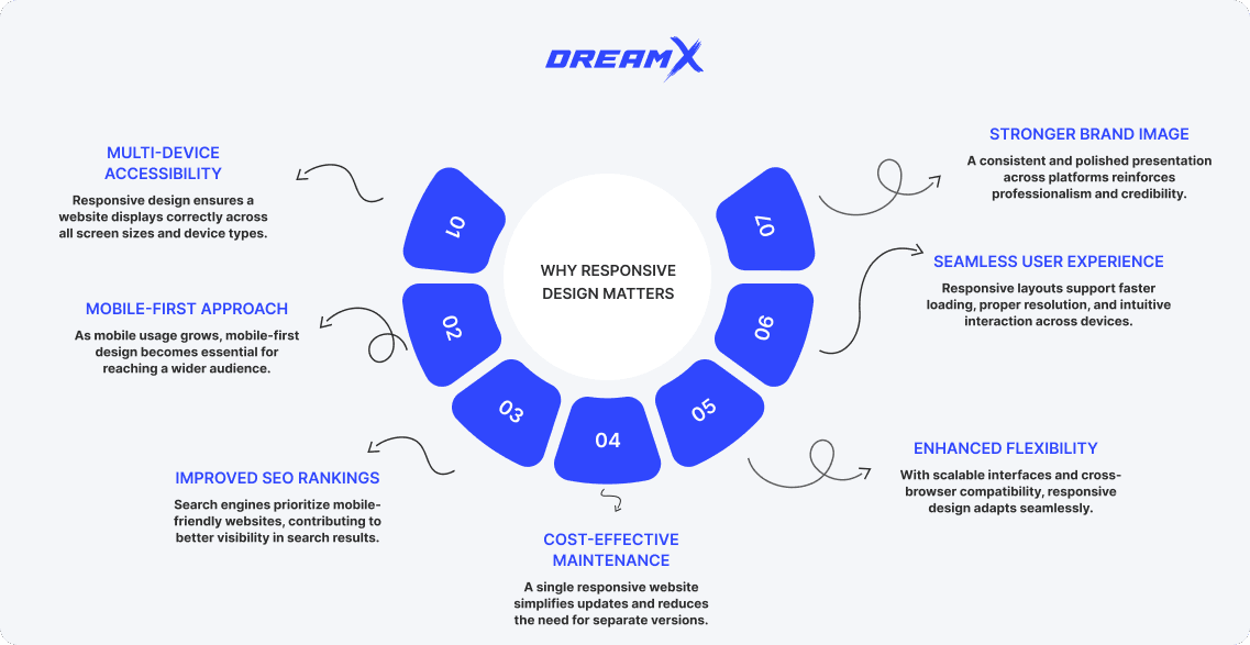
Responsive web design is a cost-effective solution that can help you save money and make changes to your website easily and quickly. Paired with a scalable user interface and browser compatibility, responsive design makes a website flexible. If you have to fix a typo on your website or just make a swift design tweak, you can do it once with a responsive web design.
Besides, responsive design ensures a smooth user experience. As a startup or business owner, you want your website to be easy to grasp and use. This way, you can persuade people to come back to the site and like it. Of course, if a user reaches your website from a smartphone and the images on the platform don’t have the proper resolution, or it takes forever to load, you can lose potential clients and partners. Responsive design can fix the situation and improve your business’s image. So, the cost to redesign an app or website can seem a bit expensive, but the result will pay off in the long run.
Responsive design functions through a combination of flexible layouts, media queries, and adaptable content that work together to create websites that adjust seamlessly to different screen sizes and devices. At its foundation, it replaces fixed-width layouts with fluid grids based on proportional measurements like percentages rather than static pixels. This allows page elements to expand or contract relative to the screen size while maintaining their relationships to other elements.
Also, advanced responsive techniques include conditional loading (delivering different resources based on device capabilities) and responsive typography that scales font sizes proportionally to maintain readability across devices.
Rather than retrofitting desktop designs for mobile, modern responsive design often employs a "mobile-first" approach, starting with the mobile experience and progressively enhancing it for larger screens.
A truly responsive website integrates several critical components that work harmoniously to deliver optimal experiences across devices. The foundation begins with a fluid grid system that uses relative units like percentages rather than fixed pixels, allowing layout elements to scale proportionally as screen dimensions change.
Flexible images and media represent another essential component. By employing CSS properties such as max-width:100%, visual content scales appropriately within its containers without distortion or overflow. Modern techniques like srcset attributes and picture elements further optimize image delivery by serving different image sizes based on device capabilities.
detecting device characteristics—primarily viewport width—and applying appropriate styling rules. These queries enable breakpoints where significant layout adjustments occur, ensuring content remains accessible and visually appealing across screen sizes.
In addition, responsive typography adapts not just in size but in line height, spacing, and sometimes even font choice to maintain readability across devices. This might involve larger text on smaller screens to compensate for reading distance or adjusted line heights for optimal legibility.
Modern responsive web design is supported by a robust ecosystem of tools and frameworks that streamline development and ensure consistent cross-device experiences. These resources have evolved significantly to address the complexities of multi-device compatibility. So, let’s look at them in detail.
CSS frameworks like Bootstrap, Foundation, and Tailwind CSS provide pre-built responsive components and grid systems that dramatically accelerate development. Bootstrap, particularly popular among developers, offers a comprehensive library of responsive elements with consistent behavior across devices. Tailwind's utility-first approach provides flexibility while maintaining responsive principles through its intuitive breakpoint system.
Next, front-end JavaScript frameworks such as React, Vue, and Angular integrate responsive design practices with component-based architecture. These frameworks support responsive behaviors through dynamic rendering and state management, allowing components to adapt based on screen dimensions and device capabilities.
Design tools have similarly evolved to accommodate responsive workflows. Applications like Figma and Adobe XD include responsive design features that let designers preview layouts across multiple screen sizes simultaneously and establish responsive constraints for design elements. Besides, there are browser developer tools that provide essential testing capabilities with device emulation modes that simulate various screen sizes, pixel densities, and even touch interactions. These tools include visual breakpoint indicators and responsive design mode for real-time testing.
There are also other tools that enhance the responsive design process. So, performance testing tools like Google PageSpeed Insights and WebPageTest help evaluate responsive sites under different network conditions and devices, ensuring that responsive designs remain fast across all platforms. For prototyping, tools like InVision and Marvel enable designers to create interactive responsive mockups that demonstrate how interfaces adapt to different screen sizes before development begins.
Developers often fall into several predictable traps when implementing responsive designs, undermining the effectiveness of their websites across devices. Perhaps the most prevalent mistake is approaching responsive design as an afterthought rather than an integral part of the development process from the beginning. This "desktop-first" mentality frequently results in overly complex CSS overrides, performance bottlenecks, and compromised user experiences on mobile devices. Equally problematic is the rigid implementation of breakpoints based solely on common device dimensions rather than content needs. This creates awkward transitions where layouts break at unexpected points between standard device sizes. Many developers also make the critical error of hiding content on mobile versions rather than adapting it appropriately, creating inconsistent experiences between devices and potentially hiding information that mobile users actually need. Performance considerations are commonly overlooked as well, with unoptimized images and unnecessary resources being loaded on mobile devices, leading to slow load times and frustrated users abandoning the site before it even renders completely.
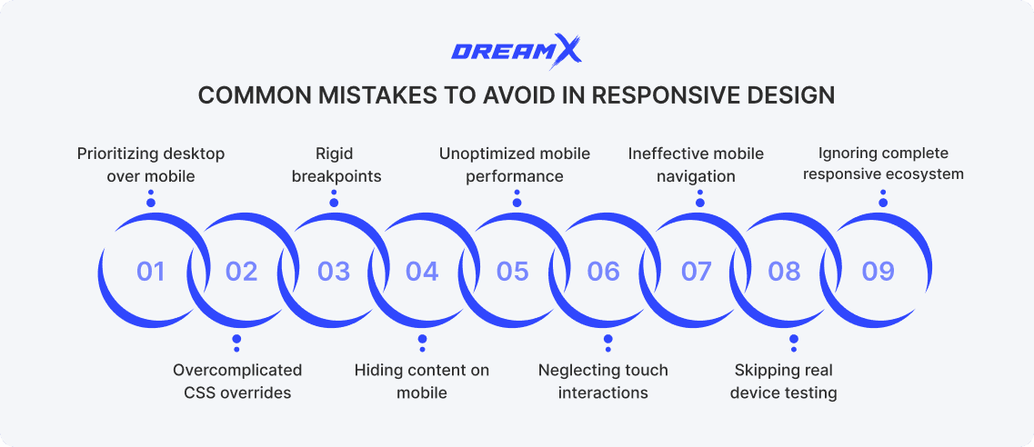
Another category of responsive design failures centers around interaction patterns and testing inadequacies. Touch interactions are frequently neglected, with clickable elements spaced too closely together or made too small for accurate finger tapping, creating frustrating experiences for mobile users attempting to navigate or complete forms. Navigation menus often receive insufficient attention, becoming unwieldy on small screens or implementing dropdown mechanisms that are difficult to use on touchscreens. Testing across actual devices rather than just browser emulators is routinely skipped, missing critical issues that only appear on real hardware with varying processing capabilities and browser implementations. Perhaps most significantly, many developers fail to consider the complete responsive ecosystem, focusing exclusively on layout while neglecting responsive typography, correctly scaled images, appropriate input methods, and content priorities that should shift between different viewing contexts. This myopic view of responsiveness creates websites that technically reflow to fit different screens but ultimately fail to provide genuinely optimized experiences tailored to each device's unique characteristics and use contexts.
Effective responsive design begins with a mobile-first approach, building the essential experience for small screens before progressively enhancing for larger devices. Prioritize performance by optimizing images, minimizing HTTP requests, and implementing lazy loading techniques for non-critical content. Use relative units (percentages, ems, rems) consistently for typography and layout elements to ensure proportional scaling across devices. Test extensively on actual devices rather than relying solely on emulators, paying special attention to touch interactions and loading times under various network conditions.
Additionally, implement accessible navigation patterns that work equally well with touch and mouse inputs. Focus on responsive navigation menu and content hierarchy, ensuring the most critical information remains prominent regardless of screen size. Maintain a consistent branding experience while adapting layouts appropriately for each viewing context.
To wrap up, responsive web design has evolved from a novel approach to an essential standard in modern web development and design. As users navigate the digital world through diverse devices, responsive design ensures consistent experiences regardless of screen size. This approach directly impacts engagement, conversions, search rankings, and brand perception, making it fundamental for digital success.
Test your site's responsiveness using tools like Google's Mobile-Friendly Test or browser developer tools to identify improvement opportunities. Remember that responsive design is an ongoing process requiring regular assessment and refinement. By embracing responsive principles, you ensure your digital presence remains accessible, user-friendly, and future-ready in our increasingly mobile-first world.
What is responsive web design? A beginner-friendly guide

Veronika is a UX/UI design team lead driven by a passion for user-centric design. She spearheads the creation of innovative and effective design solutions that elevate the user experience.
Get weekly updates on the newest design stories, case studies and tips right in your mailbox.
No junk or spam. Only useful information. We promise!

