
Have you ever wondered what made Andy Warhol’s art so unforgettable? Contrast. He knew how to grab attention and used bold colors, surprising pairings, and the mix of everyday stuff with high art. All his works were smart plays on contrast. Can this powerful tactic be borrowed for digital art and design? Absolutely, yes. The strategic use of contrast can fully transform user experience design. In this guide, we’ll show you how to use contrast in UX design and improve clarity, boost usability, and make your designs shine – same way Warhol did with art. Discover high contrast value in design!
In design, contrast is simply the difference between visual elements – just envision light and dark, big and small, or bold and subtle to understand how it works. It’s a powerful tool because human eyes are naturally drawn to these differences. Contrast guides attention, improves readability in web design, and reinforces visual hierarchy in UX. It makes the UX microinteractions smoother and more intuitive. When you use contrast correctly, users quickly understand which elements are interactive or important. Contrast also improves accessibility for people with visual impairments or color blindness.
Don Norman, a designer and author says, "The most important aspect of design is its ability to communicate and guide, letting people understand where they should go and what they should do next." Design contrast, in this sense, is a fundamental tool for clear and efficient communication.
Contrast in web design is not a one-dimensional concept. There are several attributes with visual weight in design:
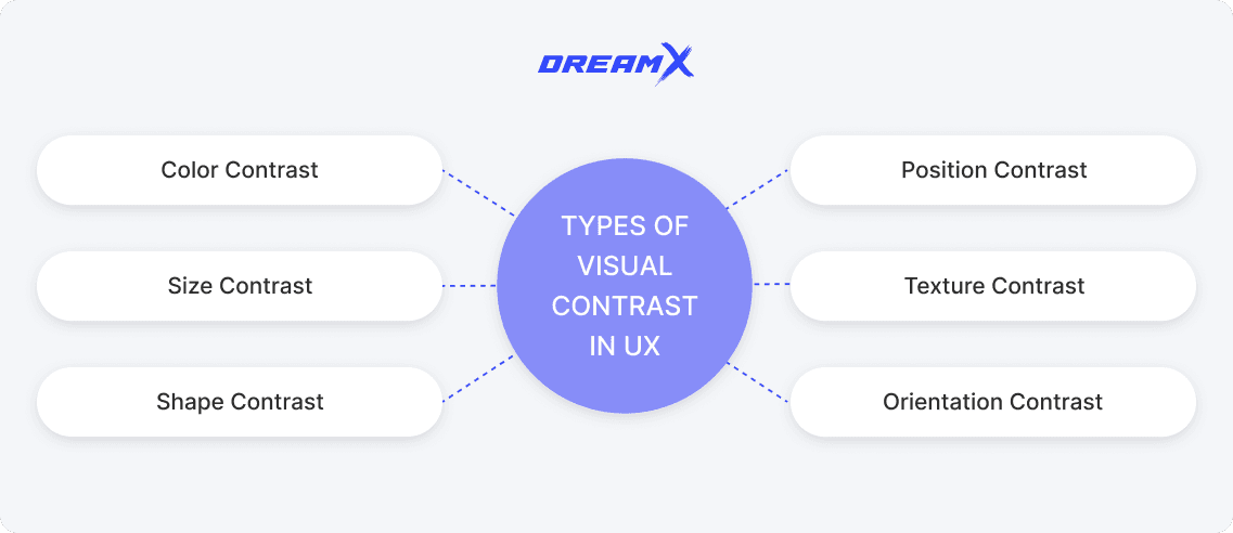
Color contrast. You have definitely seen a bright “Buy Now” button on many websites. That’s the power of color psychology in UX. Pairing light and dark shades looks sleek and also begs for attention - they’re impossible to miss.
Size contrast. Big means important, right? Imagine a huge headline with tiny text underneath – what will you read first? Size helps you prioritize content and directs users where to focus, like a design GPS.
Shape contrast. When a UX designer mixes sharp angles with soft curves, they add a special twist to their design. It’s like pairing a tailored blazer with ripped jeans - unexpected but works very nice together.
Position contrast. Sometimes, elements in unexpected spots can really shake things up. A floating sidebar or an off-grid testimonial - position contrast adds drama and intrigue.
Texture contrast. Smooth gradients combined with textured backgrounds add instant depth. Imagine a glassy, smooth overlay on a grainy texture – such a screen is more tactile and inviting.
Orientation contrast. Tilt your headlines, angle a divider, or stagger your image grids. Diagonal lines add movement and transform a static layout into something dynamic and full of energy.
Contrast steps beyond aesthetics – it directly impacts how users interact with digital products. Contrast and user focus are interconnected. Good contrast moves users through the interface smoothly, pointing important things to them and letting them do things without frustration. But when contrast is poor, even the best designs become confusing and hard to use – users get frustrated and abandonment rates grow.
Moreover, contrast in web design establishes a clear visual hierarchy and guides the user’s eye to the most important elements like headings or calls to action (CTAs). A well-placed, high-contrast CTA can increase click-through rates by up to 200%.
For millions of people with low vision or color blindness, insufficient contrast makes it difficult to see and understand content. The WCAG color contrast guidelines provide specific contrast ratio requirements to improve legibility in UI design. For example, normal text should have a color contrast ratio of at least 4.5:1 against the background, and large text needs at least 3:1.
UX accessibility standards help all users and not just those with visual impairments. In fact, websites that follow WCAG contrast guidelines have more people successfully complete tasks. Mobile interfaces with better contrast also experience less abandonment rates.
Contrast in interaction elements work as visual clues in design. When buttons, links, or forms have enough contrast, users can easily see what’s clickable or selectable. For instance, a bright, contrasting button design UX on a website signals to the user, “Click me!”
UX studies prove that websites with contrast emphasis in design - like clearly showing changes between button states (hover, active, visited) - have higher user satisfaction and see more repeat visits.
The power of contrast web design is limitless. But what does a UX designer do to achieve results? They follow UI/UX best practices.
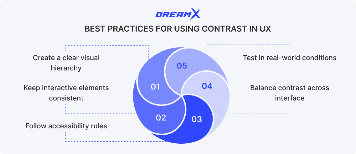
Create a clear visual hierarchy. Contrast helps users understand what matters most on a screen. Use size, color, and spacing to make headings stand out from body text, and call-to-action buttons pop from the rest of the interface.
Limit your hierarchy to 3–4 levels to keep layouts clean and digestible.
Follow accessibility rules. Good contrast improves accessibility for everyone, especially users with low vision or color blindness. Stick to Web Content Accessibility Guidelines (WCAG), which recommend a minimum contrast ratio of 4.5:1 for body text and 3:1 for large text. This small step balances contrast and usability.
Don’t rely solely on color to convey information - combine it with icons, underlines, or patterns to design for colorblindness.
Keep interactive elements consistent. Users should never have to guess what’s clickable. Make buttons, links, and other interactive elements eye-catching. You can use a bold color, a shadow, or even a hover state. Clear visual cues reduce frustration and improve task completion.
Dark mode contrast can enhance user attention flow without overwhelming the UI.
Balance contrast across interface. High contrast grabs attention, but too much can create visual clutter and chaos. Use contrast wisely - highlight primary actions but soften secondary elements with neutral tones or reduced opacity.
Use a limited color palette if you want to keep the contrast purposeful and the interface cohesive.
Test in real-world conditions. What looks great on a bright monitor may be hard to read on a phone screen. Always test your contrast in different lighting, screen types, and devices to make sure your design works well for everyone.
Use tools like Stark or Chrome DevTools to check how your design looks for people with color blindness and improve when necessary.
Common contrast mistakes in UX design can really hurt the user experience and nullify high contrast value in design. One big problem is using dull and subtle colors - this makes text hard to read and frustrates users. Another mistake is unclear clickable elements. If buttons or links don’t stand out, people won’t know where to click. Using too much contrast all over the screen is another problem - it can make the design feel noisy and hard to look at. When everything looks equally bold, users find it hard to find necessary information. And if designers don’t follow accessibility rules, people with vision issues may not be able to use the site at all. Good contrast requires planning and testing.
Let’s explore how others succeed with contrast.
Medium shows how powerful contrast can be. Main menu items and headlines appear crisp black on white, so they catch your eye instantly. The black “Get started” button pops against the neutral backdrop, guiding attention. Less critical links and labels are in soft gray and blend quietly. Inside articles, headings use bold dark tones, body text shifts to lighter gray, and blockquotes stand out with a darker shade and subtle border. This thoughtful contrast creates a clean, focused reading experience that’s both accessible and pleasing for eyes.
Google Maps uses contrast for easy navigation. White and yellow roads stand out on a gray background, and bright blue route lines keep you on track. Points of interest show up in bold orange for restaurants and blue for water – users spot these quickly and easily. In Night Mode, a dark background cuts glare and light‑gray roads stay clear. Traffic jams appear red, slowdowns in orange, so you can adjust quickly. The blue “Directions” button and white search bar stay always visible. This contrast works well across devices.
By now, you are probably wondering if your website is designed with contrast in mind. If so, DreamX is ready to conduct a website user experience audit for you. Our team of professional designers understands the nuances of responsive UX design and how to apply contrast for maximum impact. Let us analyze your website and improve your user satisfaction. Reach out to us today and take your website’s UX to the next level!
Why is contrast important in design? The power of color

Veronika is a UX/UI design team lead driven by a passion for user-centric design. She spearheads the creation of innovative and effective design solutions that elevate the user experience.
Table of contents
How to define contrast in design? Types of visual contrast in UX Why is contrast important in design? Contrast and accessibility Contrast in interaction design Best practices for using contrast in UXCommon mistakes and how to avoid them Examples of effective contrast in UXConclusionGet weekly updates on the newest design stories, case studies and tips right in your mailbox.
No junk or spam. Only useful information. We promise!

