
It’s an ongoing debate every UX designer participates in: Should I use dark mode or light mode? The first thought that comes to mind is aesthetics - dark mode looks sleek and modern, and light mode feels clean and familiar. However, the decision goes far beyond visual appeal. Each mode affects user experience, readability, eye strain and accessibility, and even device performance differently. It seems to be a simple design choice, but it may have a significant impact on how users engage with a product. Want to know everything about night mode vs. light mode? Keep reading!
Front-end UI design uses two contrasting color schemes – dark mode and light mode. Dark mode is quite popular recently – 82% of smartphone users prefer it. But is it actually better? Let’s compare both.
Light mode uses dark text on a light background, like in a printed book or paper. It remains the default for most websites, apps, and operating systems. Why? Mainly because it feels familiar and works well in well-lit settings.
Dark mode, on the other hand, reverses the rule – you see light text on a dark background. And it’s not a modern trend as is often believed. Dark mode appeared in the early days of computing. Terminals and early screens often displayed green or amber text on black backgrounds, and it was due to technical limitations. Today, black mode returned with purpose – it offers a modern look and many benefits like reduced eye strain at night or in a low-light environment.
You may think that dark or light mode is only a color swap. However, each mode changes how users process information on the screen – how they read, scan, and focus. It also affects color contrast ratio, visual comfort, and even how long a device’s battery lasts. So, it’s not a pure design decision – it’s a user experience (UX) design strategy.
Many users have no idea that the mode color choice affects how their eyes and brain respond to what they see on the screen. Let’s analyze the dark vs. light mode effect:
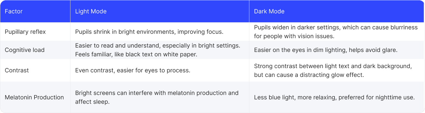
Pupillary reflex. In bright environments (light mode), our pupils shrink and their focus improves. But in darker settings (dark mode), our pupils widen to take in more light. This can sometimes make things look a bit blurrier, especially for people with vision issues like astigmatism.
Cognitive load. Light mode looks like black text on white paper and feels familiar to most of us – it’s how we have read books and documents for years. That’s why people read faster and understand better in light mode, especially during the day or in bright rooms. Dark mode is easier on the eyes in dim lighting because it gives off less light and helps avoid glare.
Contrast. Dark mode creates a strong contrast with light text on a dark background, but it can sometimes cause a glow effect around the letters. Some users find it distracting. Light mode usually offers more even contrast, which is easier for our eyes to process.
Melatonin production. Mode choice has even a link to sleep. Melatonin is a hormone that regulates sleep. Bright screens radiate more blue light and can interfere with this hormone. That’s why many people prefer dark mode at night – it’s more relaxing.
When you choose between light or dark mode, you should prioritise an inclusive interface design. In simple words, make sure as many people as possible can comfortably use your product.
People with dyslexia or astigmatism prefer light mode. That’s because black text on a white background creates a strong contrast and reduces visual distortion. But for people who are sensitive to light (with photophobia), light mode can be too bright or uncomfortable. In these cases, dark mode is better as it feels easier on the eyes in darker environments.
However, it’s still critical to make text easy to read in dark mode. For example, if you use gray text on a pure black background, the contrast may not be too strong and strain the eyes. WCAG guidelines (Web Content Accessibility Guidelines) recommend keeping a 4.5 contrast between text and background. Also, older users or those with weaker vision may struggle with small or thin fonts in dark mode, especially if the contrast is weak.
So, is dark mode better than light one for user interface design? Not always. Let users choose. Offer both adjustable settings and let your users pick what works best for them.
It’s often believed that dark mode saves your device’s battery. Is that so? Actually, it depends on what kind of screen it has. There are two scenarios:
If your device has an OLED screen (like many modern phones), dark mode can save battery. How does it work? OLED pixels light up individually, and when the screen shows black, these pixels are turned off completely. The darker the screen, the less power it needs. You will not notice a huge difference right away, but dark mode can stretch your battery a bit further.
LCD screens perform differently. They use a full backlight that stays on no matter what’s being shown. So even if your screen is black, it’s still using the same amount of energy as a white one. So, in this case, mode only influences the feel to your eyes.
Does performance affect performance? The theme switching doesn’t slow your device down. So, it’s only about OLED battery saving, but for LCDs, it’s only a style choice.
Are you making a website for a small business and hesitating between light mode vs. dark mode? Think about who will use your product. Here are some hints:
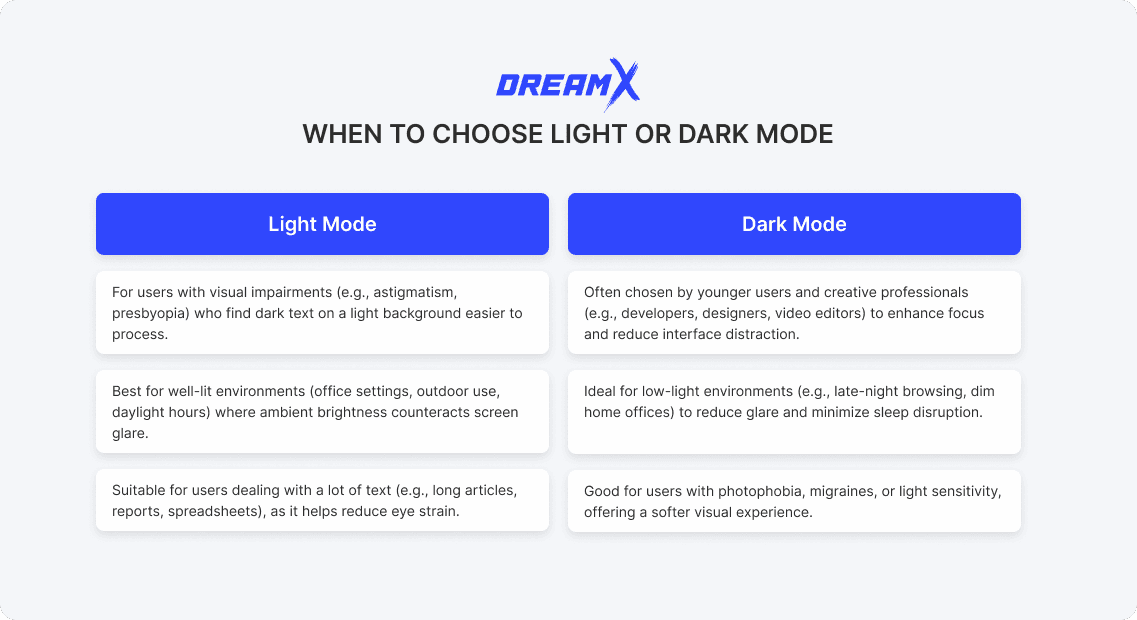
When light mode is the right choice:
For users with visual impairments, such as astigmatism or presbyopia, who often find dark text on a light background easier to process due to reduced visual distortion.
For well-lit environments – office settings, outdoor use, and daylight hours – where ambient brightness counteracts screen glare.
For users who deal with a lot of text, long articles, reports, spreadsheets, or documents. That familiar mode keeps eye strain in check.
When dark mode makes more sense:
It’s ideal in low-light environments – late-night browsing or dim home offices. Dark mode reduces glare and minimizes sleep disruption.
It’s good for users with photophobia, migraines, or general light sensitivity, as it offers a softer visual experience.
It’s also often chosen by younger users and creative professionals – developers, designers, and video editors – dark UI themes enhance focus and reduce interface distraction.
When you design for light and dark mode or both, you should create a balanced visual experience which feels right, no matter the context.
In light mode, readability is everything. Go beyond the minimum 4.5:1 contrast ratio for body text – experiment with 8:1 to ensure clarity across screens and lighting conditions. Don’t use too much white – try warmer neutrals like #FAFAF5 or #F8F7F4 to improve screen readability. Remember about user interface contrast hierarchy – first show primary content and let secondary elements fade into the background naturally. Be careful with shadows in light mode - maximum 10–15% opacity.
Dark mode needs a different approach. Avoid pure black – it creates sharp edges and visual fatigue. It’s better to use deep grays with blue undertones like #121218 or #1A1B26 to offload your UI. Bright whites also feel too much in dark contexts, so tone them down to around #E8E8E8. Spacing is recommended 4 to 8 pixels more than your light layout for better readability. If you want to add a bit of depth, try soft gradient overlays at 2–3% opacity instead of harsh shadows.
Before you call your design finished, test it in real life. Does it still look good outside in bright sunlight? What about late at night, when someone’s using it in bed? Or on an older phone screen that doesn’t show colors perfectly? There is no bad graphic design – there is poor UX. So, your design should feel smooth, comfortable, and clear for every user.
So, if you ask yourself “Should I use dark mode or light mode?” – the answer is that there is no definite winner. The best UX doesn’t make users choose, but adjusts to their world. Maybe your app turns dark at night or when the lights are off. Maybe it knows someone is watching videos and dims the screen, or goes brighter when they’re reading.
Smart design should learn what works best and change with the user. So don’t just ask which mode is better. Ask how your design can make switching feel smooth - or even mix both modes when needed. Still have questions? Contact DreamX – we are ready to provide a comprehensive consultation and expert design support!
Is dark mode better than light mode? The UX answer

Iryna is a UX/UI design team lead with a keen eye for detail and a strong understanding of user needs. She spearheads the creation of solutions that bridge creativity and functionality.
Get weekly updates on the newest design stories, case studies and tips right in your mailbox.
No junk or spam. Only useful information. We promise!

